Hermès Color Psychology 2026: The Secret Message behind Every Birkin & Kelly Shade

In the world of ultra-luxury, a handbag is more than an accessory—it’s a symbol of craftsmanship, exclusivity, and personal style, it is sort of a social ledger, a investment asset too, and a masterful study in behavioral economics, kinda. At the pinnacle of this world sits Hermès, a house that has systematically redefined the mechanics of desirability. Yes, structural engineering and strict allocations play their part, but the true language of the Maison is color.
To understand the Hermes Birkin bag, you have to get that every hue released by the house acts as a quiet signal to those in the know. So when the house unveils its newest palette under the annual theme "L’appel du large" (The Call of the Deep), color psychology becomes more tactical, more strategic, for the modern collector.
The Birth of an Unattainable Icon

Before you even decode the palette, you should trace how the Hermes Birkin evolved from a serendipitous sketch into a global benchmark of exclusivity. It started with a 1984 mid-flight conversation between actress Jane Birkin and Hermès CEO Jean-Louis Dumas. The spacious trapezoidal tote was meant, at first, for practical motherhood, and nothing more.
However, over the ensuing decades, Hermès did something quietly revolutionary, or at least that’s how it looks: they removed the straight forward, transactional nature of retail. You do n’t just walk into a boutique and buy a Hermes bag. By restricting supply, eliminating waitlists, and putting an opaque “wishlist” mechanism in place, the brand turned every single acquisition into this hard-won sort of victory.
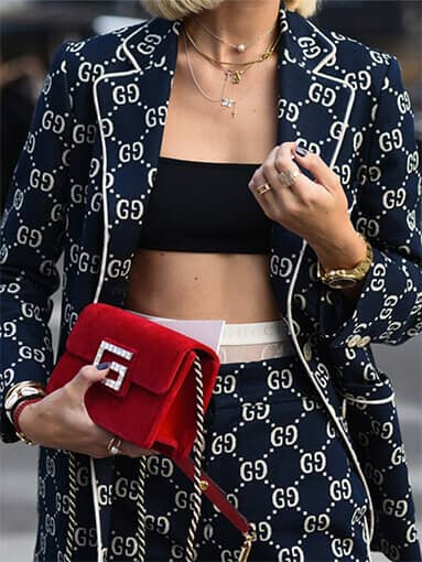
The strategy shifted the Hermes Birkin bag from mere high-quality leather goods into an elite financial asset class, consistently outpacing the stock market and gold. In this little ecosystem, getting the bag is step one; getting it in the right color is, well, the final proof of luxury status, the real culmination.
Decoding the 2026 Palette, The psychology of the new hues

Hermès’ approach to color is deeply academic, almost stubborn. A single shade can take years to get right, because the exact same pigment can look wildly different on pebbled Togo leather than it does on a smoother Swift, or a firmer Epsom. The seasonal colors feel like they’re mirroring the collective mood, or maybe the collective psyche, of the global elite.
1. The Power Pastels: Guimauve and Crème Chantilly
The surge of Guimauve, that pale marshmallow pink with cool, powdery lilac undertones, basically signals a shift in how wealth leans into hyper-femininity. Instead of the more punchy fuchsias from before, Guimauve feels more quiet, more diffused, like soft-focus film.
In color psychology, it reads as approachability wrapped in immense privilege. It reflects understated confidence—you don’t need a bold color to make a statement.
Similarly, Crème Chantilly kind of embodies that “if you know, you know” level of luxury, like, fully. It sweeps past clinical, stark whites though, and then lands in a warm ivory that feels oddly reserved, more or less, for exotic alligator leathers. Wearing an ivory exotic means your everyday risk calculus is basically… gone. It’s a shade that refuses the usual stuff, stains, crowds, practicality, all of it.
2. The New New-Neutrals: Bai Brun & Carbone
For the seasoned collector, the old-school neutrals like Gold and Noir are the base layer, but Bai Brun and Carbone give this distinct psychological pivot.
● Bai Brun: a rich, deep chocolate brown with subtle red undertones, inspired by a bay horse’s coat. Brown tones continue to gain popularity for their warmth, versatility, and timeless appeal because they read as warmth, grounding, and this quietly deliberate nod back to Hermès equestrian roots. It’s the kind of color favored by CEOs and innovators, who want to telegraph stability, plus depth, not flash.
● Carbone: sits deliberately between charcoal and slate black, with a cool blue undertone. When it’s paired with Palladium hardware, Carbone comes across as architectural precision, no softer edges, no hedging. It is sharp, urban, and it feels fiercely corporate.
3. The Statement Saturated: Purple & Jaune Mango
When Hermès introduces a primary shade like Purple, or Jaune Mango it taps into that post-neutral psychology people talk about. These colors are usually requested by collectors who already locked in their black and taupe bags, and now they want to take over the room, basically.
That vibrant, blue-tinged Purple is highly saturated, confident, almost unblinking. Historically, Hermès purples—like Anemone—tend to hold incredible secondary market value because they signal a collector who is playful yet fiercely decisive.
The Ultimate Subtext
Honestly, the hue of your Hermes bag kind of decides where you stand in the collecting little universe. A classic neutral really points to that forever-hold value mindset; a rare pastel feels like romantic exclusivity, even if you didn’t mean to say it out loud. And, as Hermès keeps on with those allocations, smoothly and on purpose, the leather’s own secret language stays pretty consistent. It’s not only that you pick a color and move on— no, Whether you choose a timeless neutral or a seasonal shade, the right Hermès color should reflect your personal style, wardrobe, and long-term collecting goals.